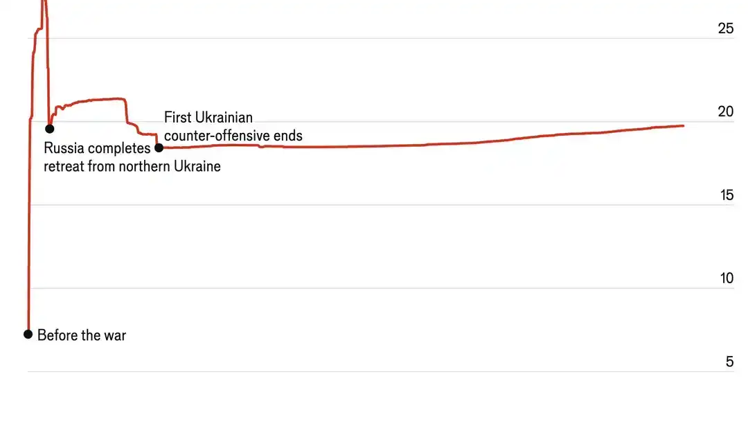
Graphs in general are much more readable when you trim them to the actual area where there is data. Do you really need perspective in a scale which goes from 0 to 100? Is 20% not clear enough?
While this is true, it is easy for graphs to be misleading without being wrong by doing this. Axes not starting at zero is probanly the most common problem, as it’s really easy for people to not notice. With this graph, you could start the y axis at 15% to make it look like Russia is advancing much faster than it is. On the other hand, showing the full 0-100% emphasises how much of Ukraine hasn’t been occupied and how slow the Russian advance is. Neither is untrue at all, but they present very diferent pictures
To be clear I do not think that the author was attempting to be misleading here. It’s just important to remember that it is absolutely possible to be misleading with the truth
The axis does start at 0. The graph does show slow advance on part of Russia, but also shows no advance on part of Ukraine since 2022.
The graph shows about 20% of the country in currently occupied, which is 1/5th and it is not a negligible amount.
This graph depicts the war objective of Ukraine, which is freeing all its occupied territories. Progress over that objective has not been achieved in a long while.
The graph does not depict the Russian war objective (at least the declared one) of conquering Donetsk and Luhansk. Providing a graph of that may be more informative regarding the war progresses of Russia.
It would also be important to judge whether amount of occupied territory is actually significant in this war. I don’t think it matters too much, as it is not parameter that will make Ukraine stop fighting unless Russia conquers the totality of it. But Russia does not appear to be going for full occupation, nor to be able to do it.
You could play with many other parameters that seem more important for this war: industrial capacity, arms reserves, man reserves, etc.
These graphs are anyway just part of the story and can be interpreted in many ways.
Assuming Ukraine has strong support and with time will be able to repeal attacks -> Russia is too slow in conquering and the war will turn tides at a certain point.
Assuming Russia has strength to keep fighting in these conditions indefinitely -> Russia will slowly but surely conquer the entirety of Ukraine.
Assuming some kind of pact will be made soon -> Russia has strong diplomatic powers as it controls a large part of Ukraine and most of its objectives.
I’m pretty sure it is. It starts at about 7%. Crimea is a little over 4% of Ukraine’s total area, and the occupied area of Donetsk and Luhansk on February 24th 2022 was a little smaller than Crimea, so adding those two up seems to account for the “before the war” value


Also, make the scale go to 100%, it really adds perspective.
Graphs in general are much more readable when you trim them to the actual area where there is data. Do you really need perspective in a scale which goes from 0 to 100? Is 20% not clear enough?
While this is true, it is easy for graphs to be misleading without being wrong by doing this. Axes not starting at zero is probanly the most common problem, as it’s really easy for people to not notice. With this graph, you could start the y axis at 15% to make it look like Russia is advancing much faster than it is. On the other hand, showing the full 0-100% emphasises how much of Ukraine hasn’t been occupied and how slow the Russian advance is. Neither is untrue at all, but they present very diferent pictures
To be clear I do not think that the author was attempting to be misleading here. It’s just important to remember that it is absolutely possible to be misleading with the truth
The axis does start at 0. The graph does show slow advance on part of Russia, but also shows no advance on part of Ukraine since 2022. The graph shows about 20% of the country in currently occupied, which is 1/5th and it is not a negligible amount.
This graph depicts the war objective of Ukraine, which is freeing all its occupied territories. Progress over that objective has not been achieved in a long while. The graph does not depict the Russian war objective (at least the declared one) of conquering Donetsk and Luhansk. Providing a graph of that may be more informative regarding the war progresses of Russia.
It would also be important to judge whether amount of occupied territory is actually significant in this war. I don’t think it matters too much, as it is not parameter that will make Ukraine stop fighting unless Russia conquers the totality of it. But Russia does not appear to be going for full occupation, nor to be able to do it. You could play with many other parameters that seem more important for this war: industrial capacity, arms reserves, man reserves, etc.
These graphs are anyway just part of the story and can be interpreted in many ways.
Assuming Ukraine has strong support and with time will be able to repeal attacks -> Russia is too slow in conquering and the war will turn tides at a certain point. Assuming Russia has strength to keep fighting in these conditions indefinitely -> Russia will slowly but surely conquer the entirety of Ukraine. Assuming some kind of pact will be made soon -> Russia has strong diplomatic powers as it controls a large part of Ukraine and most of its objectives.
And I assume Crimea isnt being calculated in this.
I’m pretty sure it is. It starts at about 7%. Crimea is a little over 4% of Ukraine’s total area, and the occupied area of Donetsk and Luhansk on February 24th 2022 was a little smaller than Crimea, so adding those two up seems to account for the “before the war” value
Well I’ll be, I thought Crimea was a larger part of ukraines total size!